JapanForum.com  


Reply
 
LinkBack Thread Tools
(#191 (permalink))
Old
RKitagawa's Avatar
RKitagawa (Offline)
JF Old Timer
 
Posts: 345
Join Date: Jul 2007
Location: The Dark Side of the Moon
Send a message via MSN to RKitagawa
06-29-2009, 12:39 AM

Quote:
Originally Posted by JackIsLost View Post
i really like your style. it reminds me of how my oldest brother used to draw before he went into the muscular everything craze. muscular women too... just not my thing. great sketches! keep it up
haha cool. Although, I hope I don't have a sudden fascination with drawing muscular women...

Quote:
Edit: seems like you are the one that helps people improve their art... so i shouldn't tell you to keep it up, hahaha you are good.
lol, I'm far from perfect tho, I need help with my art too! Thanks!


Quote:
Originally Posted by VampireGirl1314
did this one while mom was cutting out skirt patterns.
whoah, this art is really improved over the last stuff you posted VampireGirl! congrats
I'll post a quick paintover in a minute, gotta find my tablet...
Reply With Quote
(#192 (permalink))
Old
RKitagawa's Avatar
RKitagawa (Offline)
JF Old Timer
 
Posts: 345
Join Date: Jul 2007
Location: The Dark Side of the Moon
Send a message via MSN to RKitagawa
06-29-2009, 02:04 AM


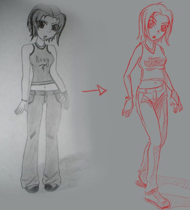
Here ya go VampireGirl.
okay so, her head and her body kinda seem like they're on a 3/4 view. but the legs and arms look like a front view.
Instead of drawing the legs side by side, you should practice drawing one in front of the other, in a more side-ways view.

I really do think it's a vast improvement, and I'm particularly glad that you drew the hands. keep drawing those hands!

some small things to look out for:
the clothes go around the body, not across it. look at the bottom of the shirt and the top of the jeans, the cloth should wrap around her body.
your shoulders are too high and square, try to round them off a bit more and angle them downwards.

hmmm, what else... oh, the writing on her shirt should follow the direction of the cloth. And when doing writing, it;s usually a good idea to do like.. block letters, give them thickness.
and, her hair, even though her head is tilted, the hair should still be pointing towards the floor. So that it looks like it's being affected by gravity. (you actually kind of did do that... but you can push it a little more)

thats all i can think of. hope it helps, and keep up the great work!

Last edited by RKitagawa : 06-29-2009 at 02:07 AM.
Reply With Quote
(#193 (permalink))
Old
VampireGirl1314's Avatar
VampireGirl1314 (Offline)
~I cant leave you~
 
Posts: 1,261
Join Date: Jun 2008
Location: Japan 日本国, Jk Jk I live in Mexicali Mexico Baja California.
Send a message via MSN to VampireGirl1314 Send a message via Yahoo to VampireGirl1314 Send a message via Skype™ to VampireGirl1314
06-29-2009, 09:19 AM

Quote:
Originally Posted by RKitagawa View Post


Here ya go VampireGirl.
okay so, her head and her body kinda seem like they're on a 3/4 view. but the legs and arms look like a front view.
Instead of drawing the legs side by side, you should practice drawing one in front of the other, in a more side-ways view.

I really do think it's a vast improvement, and I'm particularly glad that you drew the hands. keep drawing those hands!

some small things to look out for:
the clothes go around the body, not across it. look at the bottom of the shirt and the top of the jeans, the cloth should wrap around her body.
your shoulders are too high and square, try to round them off a bit more and angle them downwards.

hmmm, what else... oh, the writing on her shirt should follow the direction of the cloth. And when doing writing, it;s usually a good idea to do like.. block letters, give them thickness.
and, her hair, even though her head is tilted, the hair should still be pointing towards the floor. So that it looks like it's being affected by gravity. (you actually kind of did do that... but you can push it a little more)

thats all i can think of. hope it helps, and keep up the great work!
*giggles* thanks.^^

and i hadn't been drawing since the last pic so i was very sleepy and bored and started to draw.^^

I'm glad that i have improved a bit.^^

i didnt use a scanner still don't have one but next time.

and the clothes i still cant seem to draw yet, its like i can draw the doll but not the clothes.*freaks out*
lol thanks for the help.^^


I could never be happier.
I found my missing piece and i know he wont leave me.
song by simple plan.
+{Member of the Crusnik Clan--Crusnik 04}+
+{Codename: Abel}+
I'm sorry for acting like this...
Reply With Quote
(#194 (permalink))
Old
kmq's Avatar
kmq (Offline)
New to JF
 
Posts: 2
Join Date: Jun 2009
06-29-2009, 10:04 AM

*first post

here's mine simple graphic design


original size here
Reply With Quote
(#195 (permalink))
Old
RKitagawa's Avatar
RKitagawa (Offline)
JF Old Timer
 
Posts: 345
Join Date: Jul 2007
Location: The Dark Side of the Moon
Send a message via MSN to RKitagawa
06-29-2009, 12:47 PM

Quote:
Originally Posted by kmq View Post
*first post

here's mine simple graphic design
nice picture kmq! looks kinda like super mario in the star wars universe. I looked through your stuff on DA too. Really like your web designs, and t-shirt designs.

great stuff, keep it up!
Reply With Quote
(#196 (permalink))
Old
RKitagawa's Avatar
RKitagawa (Offline)
JF Old Timer
 
Posts: 345
Join Date: Jul 2007
Location: The Dark Side of the Moon
Send a message via MSN to RKitagawa
06-29-2009, 01:44 PM

Quote:
Originally Posted by TheLastFortnight View Post
Here's one of mine, what do you think Kitagawa?
haha, I really like it actually. great style.

few things I noticed:
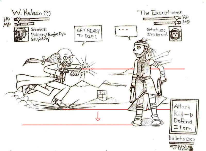

I don't know if this is intentional or not, but if W.Nelson shoots his gun there, he's gonna miss. lol, that might have been on purpose, i dunno? I see he does have a stupidity status haha.
but yeah, if you want him to look like hes gonna hit, you have to move him down so that his feet line up with the feet of the executioner.
If you were trying to make it look like he was clearly gonna miss then just ignore me lol.

other things were: executioner's left leg was too high, since we pretty much have a direct front view of his body the feet should line up.
I also think the grass that you drew was a bit much, when drawing grass I find it's usually better to draw the least amount possible in order to get the idea across. And it should be spread out more instead of all being in that one clump. It wasn't bad grass, there was just an unnecessary amount (that's just my opinion though).

feel free to post more!

Last edited by RKitagawa : 06-29-2009 at 01:48 PM.
Reply With Quote
(#197 (permalink))
Old
RKitagawa's Avatar
RKitagawa (Offline)
JF Old Timer
 
Posts: 345
Join Date: Jul 2007
Location: The Dark Side of the Moon
Send a message via MSN to RKitagawa
06-29-2009, 02:39 PM

Quote:
Originally Posted by TheLastFortnight View Post
Thanks!

Well, for W. Nelson, he wasn't aiming directly at the Executioner, he was just concentrating the energy at his gun, then he would run at her, jump and shoot.

In RPGs the characters usually do this before casting a spell, so those balls are the energy charging at his gun.

The Executioner leg was that way because my intention was to show her moving, I mean she was turning 180 degrees to see the sudden attack from Nelson, but I guess I'm not good drawing the characters moving.

You're right about the grass, actually I was trying to write TLF using the grass; it's my username abbreviation, haha.

Anyway, great comments, I'll post more soon. I've just redesigned the Executioner, when I scan it, I'll post here, thanks ^_^
ah, ic ic. then the leg is actually about right, turning motions are usually indicated by cloth wrinkles in the direction of the turn and the arms+torso twisting. I think u just have to push it more, it seems more like a 90 degree turn than 180.

lol I completely didn't notice the TLF in the grass there. I see it now tho.
Reply With Quote
(#198 (permalink))
Old
alexus's Avatar
alexus (Offline)
New to JF
 
Posts: 20
Join Date: Jun 2009
06-29-2009, 04:30 PM

hi, this is some of my work i done previosly...

Sketches


photoshop


photoshop paint Monster Design


3d


will share more of my 3d work later on if you guy interested...


=j

Last edited by alexus : 06-29-2009 at 04:48 PM.
Reply With Quote
(#199 (permalink))
Old
MissMisa's Avatar
MissMisa (Offline)
Fashion, Games + Art Mod.
 
Posts: 2,466
Join Date: Mar 2008
06-29-2009, 05:17 PM

Something I drew years ago but only just finished! (It didn't take me that long, haha, I just forgot about it.)


Last edited by MissMisa : 06-29-2009 at 05:22 PM.
Reply With Quote
(#200 (permalink))
Old
RKitagawa's Avatar
RKitagawa (Offline)
JF Old Timer
 
Posts: 345
Join Date: Jul 2007
Location: The Dark Side of the Moon
Send a message via MSN to RKitagawa
06-29-2009, 06:46 PM

Did a picture today, haven't drawn anime in a while, so I did that.
just practice on anatomy and coloring.

ugh, i hate the lineart tho, its terrible...


bikinis FTW! (hope that's acceptable here lol... shes not naked or anything...)


@MissMisa and Alexus - sorry I don't have time right now to do a proper critique of your stuff, I'll make sure I do later today! I'm liking what I see tho.
Reply With Quote
Reply


Thread Tools

Posting Rules
You may not post new threads
You may not post replies
You may not post attachments
You may not edit your posts

vB code is On
Smilies are On
[IMG] code is On
HTML code is Off
Trackbacks are On
Pingbacks are On
Refbacks are On


Copyright 2003-2006 Virtual Japan.
SEO by vBSEO 3.0.0 RC6