
 |
|
|
||||
|
06-30-2009, 06:46 PM
I'm not very good at art and I don't really do it much... if at all. These are some charcoal paintings I did in an art class I took as a required course for my A.A degree last year.
I don't know if the reference links still work as its been quite a while but I posted them anyways.  A charcoal drawing I did in one of my classes. The original picture was found in a National Geographic Book..The picture was extraordinarily dark when I took the picture so I played around with the curves (photoshop) to lighten the image a bit.  A charcoal drawing I did in one of my classes to create a feeling of awareness. References were used in this picture from a random Google search. Link 1= Here Link 2 = Here  uhm...just some random drawing I did for the hell of it...took me 45 or so minutes to do. references: Link 1 = Here Link 2= Here  This is another random charcoal drawing I did. It took me around an hour and a half I think. It's the last charcoal drawing I have done, I don't plan on doing any more...it was fun playing with the medium while it lasted though :P anyways references: link 1 = Here Link 2 = Here Link 3 = Here You can find the same things in my deviant art (sphynx006 is my user name) |
|
||||
|
06-30-2009, 09:10 PM
yo, Khengi
sorry, I took longer than I thought. 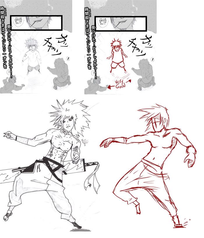 So, First picture, all you really had to do was move the head forwards and shorten the upper half of his body a bit. It looked like he was kinda falling backwards. It's a tough angle to draw though. I had quite a bit of trouble with it. To improve on this stuff try to practice drawing cubes and cylinders in perspective. As for the second picture, I just wasn't really sure what the pose was supposed to be? It looks like an action pose, but I'm not quite sure which direction he's moving. Even though the direction of the hair indicated that he was moving to the left of the picture. His body looked more like it was falling to the right. Try doing the action yourself before drawing, or think in your head about what the full action would look like. Once you can imagine what the full action would look like in motion, you should be able to more easily draw a single pose from that action. As for the perspective websites. I don't know of any, but I can teach you if you'd like. What about them would you like to learn? just the basics on how to do it? Hope I helped a little. |
|
||||
|
06-30-2009, 09:26 PM
You helped a lot, thanks!
I mostly need help with overall scene perspective. How to make every object (whether animate or inanimate) blend with each other to be in shape? When drawing a scene with buildings, how to make sure they're all in a realistic line, no matter how complex the scene? Simple stuff like that. |
|
||||
|
06-30-2009, 09:38 PM
Quote:
I don't really have much of a critique cause there wasn't much that was "wrong". But if you do more charcoal drawings, I'd say just practice with them to get cleaner pictures because Charcoal is always a mess. 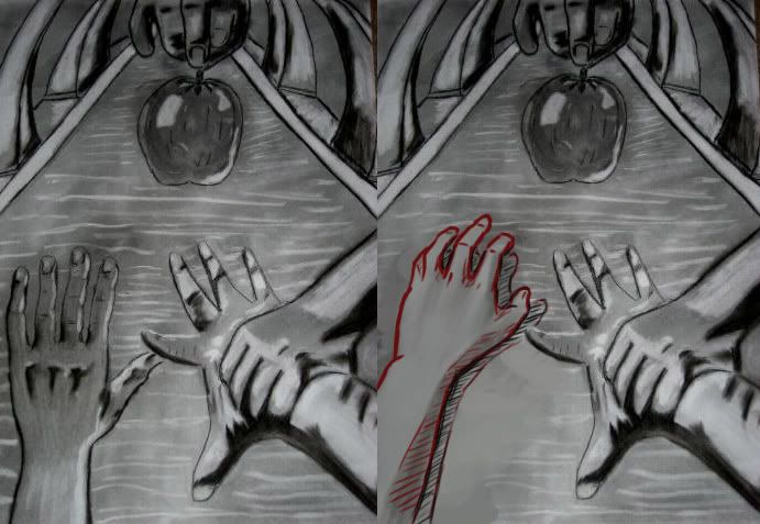 this was the one thing I noticed that really didn't look right. That one hand doesn't follow the perspective of your scene at all. You just have to keep an eye out for those things. |
|
||||
|
06-30-2009, 10:44 PM
Quote:
 Here's some stuff on perspective:  You know the basics right? 1: draw horizon line and your 2 vanishing points 2: Draw the corner of the building, and lines leading to both VPs 3: draw two more vertical lines to make a basic cube (and basically everything else after is more of the same. 4: More cubes done in the exact same way, you can push them around anywhere in your scene as long as the "horizontal" lines go to the vanishing points 5: when detailing stuff it's simply more of the same. just follow those vanishing points and everything will work. I hope that's not too vague of an explanation, but I don't know how much you already know. As for 3 point perspective, you simple add a 3rd vanishing point up above, or below in some cases. (forming a triangle with the 3 VPs) and then all the vertical lines will lead to that point (instead of simply going straight up and down.) Now, here's something that is hopefully a little more useful:  1: Say you drew a person on the street, and you wanted to know what size he would be if he was standing on those green circles. 2: The first green circle is simple because it lines up nicely with the person, you simply draw two lines, one for where the feet will go, and one for the height. So, these two people are technically the exact same height now. 3: the second green circle is a little more complicated, since it doesn't line up. -extend the two lines past the person -draw a line from the second vanishing point, through the green circle, and then intersecting with the bottom line -from there you can easily figure out the height as shown. I don't know if that's what you were asking. If you have any more specific questions let me know.  |
|
||||
|
06-30-2009, 10:51 PM
That was EXACTLY what I was asking for! I only have one more perspective questions:
When making pictures (landscapes) that 'bend', per se, what is the rule to follow? (like the vanishing points) (This image is too big to post, so I'll give you the link) http://media.onemanga.com/mangas/000...3222/06-07.jpg What is the set up for that image? ありがとうぅぅ! |
|
||||
|
07-01-2009, 12:08 AM
Quote:
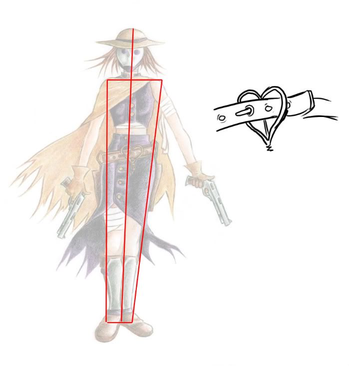 As far as I can tell from this picture it looks like it doesn't actually do anything, In fact, I don't even know if it is a belt buckle. If you wanted it to be functional, it would look like what I drew there. About the drawing itself, there really isn't that much wrong with it, just a few things. As you can see, it's a little bit tilted, so that needs to be straightened up. and really, the only big problem with the actual drawing is the pose. look at it, you can draw one straight line directly through her, that's a sign of a boring pose. You want it to be more dynamic, especially with an awesome character like that, she should be doing something other than standing around! But I really do like the design, in fact, I like it so much that I couldn't help but draw her: 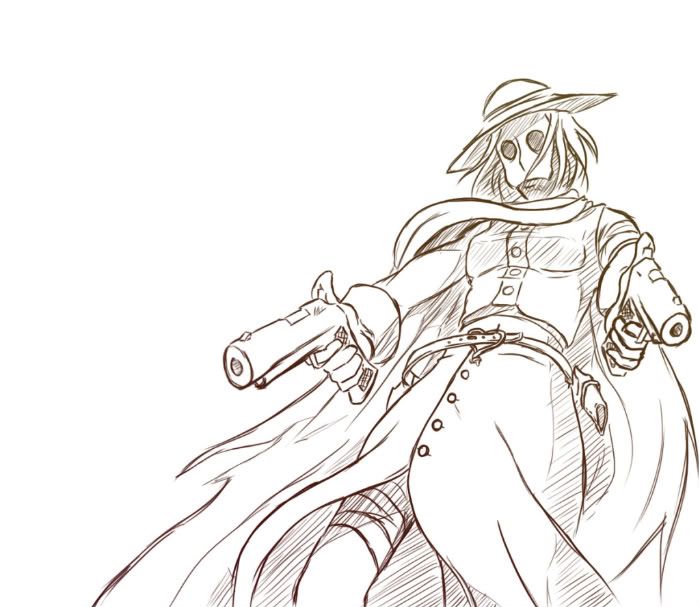 You should start experimenting with perspective like this. Draw things from above, below, behind, on the side. Every angle you can possibly think of, Draw It! You're definitely ready for more advanced stuff like that. If you don't know much about perspective yet, start simple. Draw simple objects in 1 point perspective, then 2 point, then 3 point, and possibly 4-5 point. Then try drawing more complex objects in 1, 2, 3, and 4 point perspective. as for your second picture, I see no problems |
|
||||
|
07-01-2009, 12:24 AM
Quote:
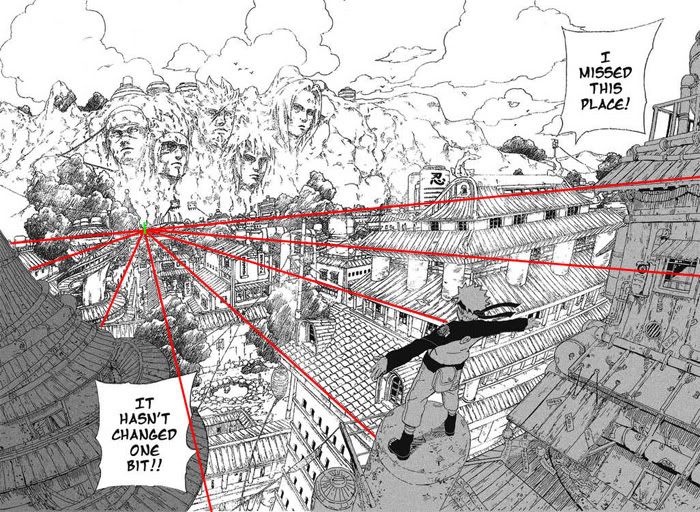 see? can you find a better example? or explain better? sorry. |
 |
| Thread Tools | |
|
|